

Understanding the Topic
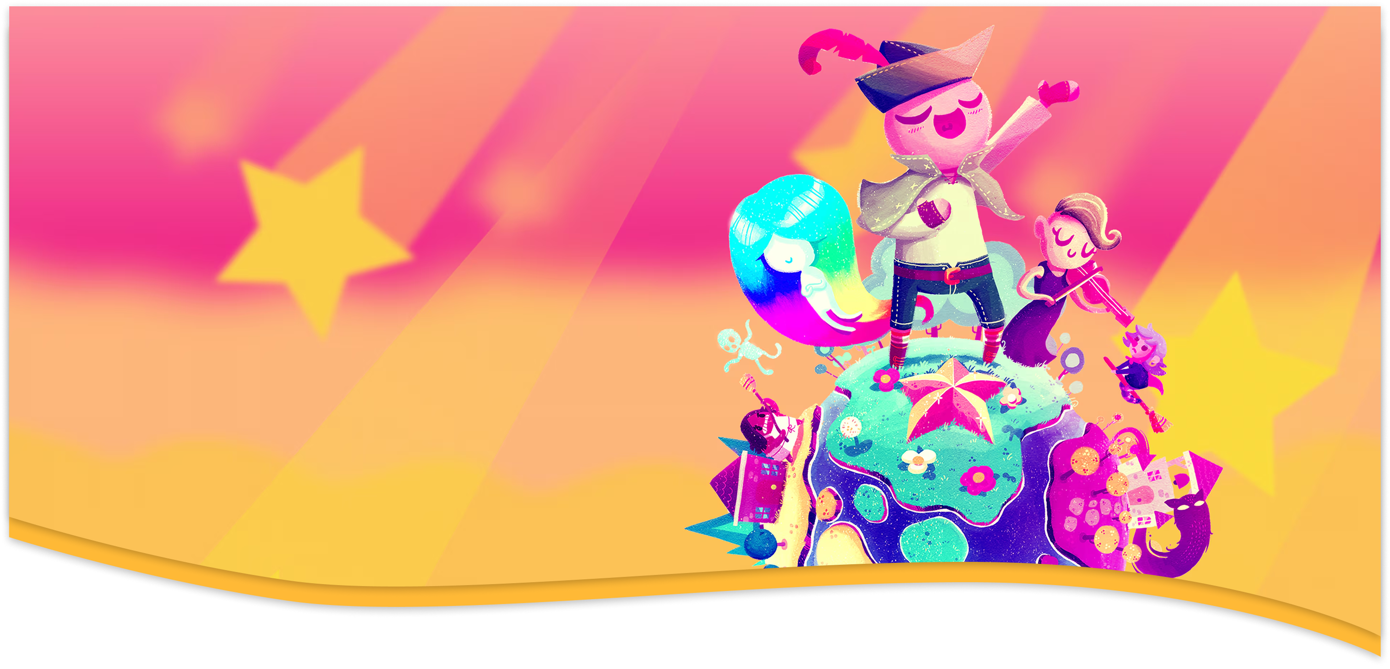
Before the project, I was completely unfamiliar with both video games as a whole and Wandersong specifically. I spent time researching the game play, sound history, themes, mechanics, and visual identity to understand how to translate its personality into a web experience. The creative brief emphasized joy, color, music, and playful storytelling, along with inspiration from layered paper.
Design Process / Inspiration
Conceptually, I struggled with being able to put the creative direction ideas into a web design that felt not only artistic but also web friendly and still maintained a strong UX identity. I explored many different approaches to navigation, structure, and visual systems. Because there are so many motifs that tie into the game I narrowed down to emphasize the bright color palette, the cut paper layer feel, playful typography, as well as including animated gifs and asymmetrical cards for information layouts. The entire visual identity of this microsite was inspired by the geometric environments and musical themes of the game.
Creative Direction Feedback
Feedback from my creative director played a major role throughout the process. Early feedback suggested that my original single-page concept should be divided into multiple pages and include more visuals, stronger navigation clarity, and character-focused sections.
Use of AI
The basis of the website was coded by me. I created the structure, layout, content, individual sections and all design choices within VS Code were created by me. The wave dividers were created using an online wave generator and the SVG code was edited by me to fit the design. The areas where I used AI was to clean the copy from larger paragraphs into smaller sectiosn which I then refined into the content and structure it has now. I also used AI to help implement the wave dividers, the tilt of the boxes and buttons, as well as a lot of help with figuring out how to make the navigation and footer responsive since I designed those in Figma and exported those as PNGs to add to my code. I also used AI in a similar manner to help me with the home page hero section, which I also designed in Figma and exported as a PNG to add to my code. I used AI to help me figure out how to make the text and image responsive and layered in the way that I wanted it to be. Ultimately, I struggled with the responsiveness of the website in relation to the creative choices I was attempting to make and I used AI to help me figure out how to make those creative choices work within the constraints of web design and development. One of the biggest challenges I had was that I didn't really have any skills in designing websites or coding before this project, so I had to learn a lot of the basics of web design and development as I was working on this project. The navigation bar alone took me 7 hours to create and implement and it still isn't perfect in terms of responsiveness. This is the same for the text in the hero. I also wanted there to be a sense of uniqueness with the wave dividers and the colors of the sections so I used AI to help me figure out how to implement that design choice in a clean way. Ultimately, I did have to lean on AI to help me make parts of my site more technically functional and responsive, but I made every creative choice and coded the basis of the webiste on my own which I am extremely proud of and I feel that the final product represents my vision for the project.